Christmas – the countdown!

zahlen2016

The Christmas season is always a special time for the members of my ravelry-group. Each year we organise an Advent Calendar that is truly unique and lets us grow together more closely as a group. In this calendar everyone can contribute. Many of our group´s generous knitters share their Christmas recipies, their stories and some tips to make Christmas-themed decorations, among other things. I enjoy these little glimpses into everyone´s home and decoration style as well as into their kitchen (oh those cookies from last year!) tremendously. Knitters are one kind of a people, learning more about them is always truly rewarding and is enriching my life very much.

Also, in the calendar, 24 of my patterns will be available with a discount. And, last but not least, you can win some yarn! Every day there is going to be a lottery. All you have to do to be eligible, is chat with us! So come join in!

Tagged , , , , ,

Sssshhh, December mystery knitting

mystery_kal-cover

It is cold outside – the days are never shorter than during the Christmas season! – and it is extremely cosy inside. So how about spicing up the Advent season with a bit of mystery knitting on your super inviting couch? I am not revealing (much) more than in this mystery, we´ll be knitting a shawl. Like the one we made last year, only that it is very different. Ok, this is not very helpful, but it is going to be a mystery-kal, so I am supposed to be secretive about it. I put together a post on ravelry, where our kal will take place, that explains the details I can let you know already. Will you join us? I´d love to see you over on ravelry!

Tagged , , , , , , ,

Yarn and colours

img_1350


If you have been following my latest posts, you´ve started to delve into the topic of colours with me a little bit already. And it is such an interesting subject, I feel like I will never stop talking about it.

What is on the bottom of this issue, i.e. colours in knitting, is, of course, the yarn itself. Except you are dyeing your yarns at home – then this won´t be of much interest for you. But most knitters, at least on occasion, will purchase coloured yarns and thus draw from the palettes the yarn companies have to offer.

To me this provides endless fascination.

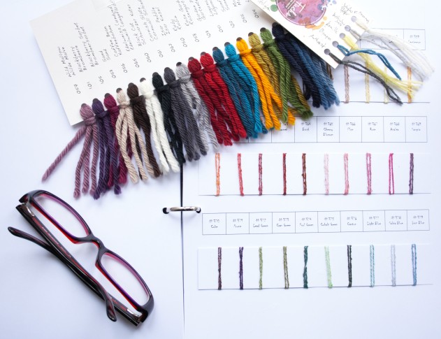
Some yarn companies go for a very unique and distinctive palette. For example, ITO works with colours that are originally aimed at the Japanese market, and have the appeal of being slightly exotic and unique to us Europeans. It helps that the colours are stylish and tasteful. Also, their fine yarns can easily be held double, which opens up new possibilities for combining colours.

Others offer limited but all the more exquisite colours, like Rosy Green Wool. All their colours are dyed obeying the strict GOTS rules, which is giving us knitters peace of mind and does not restrict the appeal of their colours at all. Plus, there are often limited editions for a couple of special colours for knitters who like to switch things up once in a while and who appreciate seasonal offerings.

Frida Fuchs, an German indie dyer, specialises in brilliant colours of great clarity and often amazing depth. Their colours are modern and at times influenced by the Pantone Fashion Color Report.

Of course there are many more yarn companies that have each their unique styles and palettes. I just picked these three for my post because they are among the yarn companies I have been working with during the last few months and that put them on the top of my mind.

So which colours do knitters choose the most often? It´s the greys. This makes a lot of sense. Grey knitted pieces are great matches with many items in almost any wardrobe. Plus, grey yarns can be mixed with just about any other colour and will balance out the chosen palette for a project.

Rosy from Rosy Green Wool has a great tip for choosing your colours: Get one of their shade cards and place the colours you are thinking about combining next to one another. Colours interact in the most interesting and often unexpected ways and no method is better than this trial-and-error real-life approach to combining colours (and we all know how our screens can deceive us!). – Read more about the complex interaction of colours in a recent post on the blog. – Also, Rosy regularly presents colour combinations on her Instagram and suggests you have a look at your wardrobe to find out which colours will complement it well before you decide on the yarn for a project.

And how does living a life for colours affect the producers of yarn more generally? I have heard the story of a lady who found out new favourite colours that totally took her by surprise – she didn´t think she´d actually like greens – simply due to the fact of almost constantly having colours on her mind. And it brings out creativity in people. Which is not least pourred into finding appropriate names for the colourways. Frida Fuchs, for example, only chooses colour names that go back to something edible or drinkable, which results in charming names like „Hubbards“ (a pumpkin), „Etna“ (wine) and „Mastix“ (the gum of the matic tree).

And of course, having every step of the process of dyeing GOTS labelled is one way to respect the environement which will undoubtedly encroach on other aspects of ones life too. It is one way to be mindful and kind, which is very important in times where the pace of life seems to be incredibly fast and everyone is stressed out all the time. We knitters are taking back taking some time. We produce something beautiful and useful and enjoy the process as much as the result!

Tagged , , , , , ,

Mix It Up! (again)

Colours are a complex thing. As are fibres. And I enjoy to experiment with both when working with the ITO – fine yarn from Japan yarns. They are thin enough that it is very possible to work with two of them held together, creating a marled effect of colours and texture.

You can, for example, combine a hard with a smooth fibre. I like to spice up Urugami, which has a paper core, with the soft wool-mohair-silk blend Sensai that has a distinct halo. This way the texture of the resulting yarn is a mixture of the two. It has the strength of the Urugami, and the squishyness from Sensai. It is one of my favourite ITO combinations.

But let´s talk colours now, as I promised. Because noone has the time to knit swatches for everything, I just wrapped yarn around a white cardboard gift tag for my examples. It works well enough to illustrate the effect holding two or more threads of yarn together has on the overall colour of the resulting yarn and fabric.

ito_mix6


Here I am combining Urugami once in cold Mint and once in warm Mauve with different Sensai colours (from top to bottom Pool Blue, Moss, Lemon, Tangerine, Crocus, White, Smoke Grey, Charcoal). The Sensai colours blend with the Urugami shade resulting in much softer stripes than the Sensai colours alone. Also, that both colours peak out looks very appealing and gives the knitted piece some depth.

When using this technique sparsely, only occasionally adding in a second thread in a knitted piece, the parts worked with two threads, the motifs, will look almost printed. I did that in my Imprinta scarf. The look is so striking that it inspired the shawl´s naming. And in several other designs I have been working with more than one thread at a time also. Among them are North Sea Mist, Goliatha, Abacatha, Rheindrops and Lineares. Knitting any of these will get you started on your journey of exploring fibres and open up your horizon to completely new possibilities in the world of knitting. If I say so it must be true, right? 


Another wito_mix4-2-copy2_klein
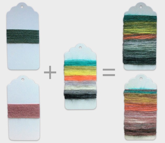
ay to use the blending effect of working with several strands is to wind a yarn with four strands of one colour. Next wind a yarn with three strands of the base colour and one strand of a contrast colour. Then wind a 2-2 yarn and a 1-3 yarn, and finally a yarn that consists of four strands of only the new colour. You have created your own gradient yarn!

Knitters are a creative group of people, I am sure many of you are already planning new projects in your head even as you finish reading. Please tag me on social media, especially instagram, (@janukke) so that I will see them if you are mixing yarns too!


Tagged , , , , ,

Lineares Mystery Shawl

Lineares Shawl Mystery
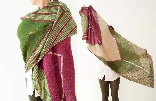
Starting on October 8th, we will be knitting a comfy shawl together in my ravelry group Janukke Strickdesign.  It is going to be a mystery-KAL. I am telling you about it now so that you have a few days to organise and get your yarns and needles ready. If you need a little longer than that, it´s not a problem at all. The first clue isn´t elaborate, it will be easy to catch up if you join in a few days late.

The shawl will surprise you with its multi-directional knitting, resulting in a bold-looking construction, along with its interesting fibre study. You‘ll be working with yarns of two different weights. Or, if using the original ITO yarns, namely Wagami, Sensai and Tetsu, you will often work with yarns of two different qualities held together – a truly unique fabric is the result!

For those of you who hear the word “mystery” in the context of knitting for the first time: This means that you won´t know what the finished item will look like when you start knitting and will get the instructions bit by bit in a couple of clues.

To find out more, to join in and to get to know your fellow mystery knitters, pop over to ravelry!

Tagged , , , , , , , , , , , , , , , ,

It´s in the eye of the beholder

optical_mixture_swatch
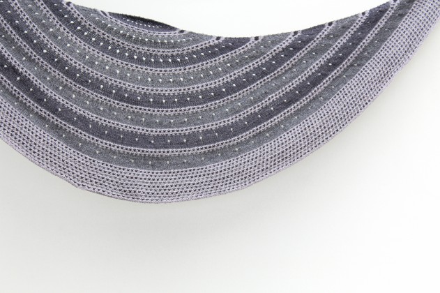
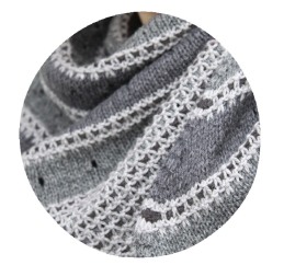
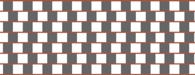
When I was reading about colours this summer, I came accross something that is called “optical mixture”. It´s a fancy name for something we all know well: When you see a pattern of tiny yellow and blue dots from a distance,  you will get the impression that the area they cover is actually green. If you retreat far enough, you can no longer discern the individual dots and colours. That´s the reason why, in printing, it is possible to accurately depict a wide range of colours with only Cyan, Magenta, Yellow and Black (CMYK) as bases  without the image looking all spotted. The clue is to print tiny dots.

So what does this mean for knitting? Well, I had the idea this says for knitting that, with only three colours, you should be able to create the illusion of a colourful knitted fabric if choosing the right texture pattern. For my swatch I used the Triple L-Weed pattern because it is simple and all three colours are equally important.

If you try this at home, choose colours of three different hues.

You can create a blending effect by starting with a solid colour, here I started with yellow, and then adding in another colour, for example teal.  At first add in just a bit of the new colour, then work it more and more frequently until it becomes the next solid colour. I demonstrated this in the bottom half of my swatch.

Or you can randomly change colours for a multi-coloured look as in the upper half of the example. I think choosing a dark colour that is not anthracite would have enhanced this effect even more – but I had no dark colour at hand that I liked with the other two. And since I wasn´t patient enough to purchase the correct colour before casting on, this will have to do. – Even with this limitation though this gets my imagination going. I think I need to start working on a new design right now.

Verum

Now you can already put to use the information of the last post: My new shawl pattern, Verum, invites you to pick three colours that then get distributed over a pattern of stripes and short row segments. Verum makes this easy for you, so long as the three colours go well together, nothing can go wrong in this shawl. It doesn´t matter where you place the accent colour or which palette you go for.

The pattern asks for fingering weight yarn, preferably Frida Fuchs REMMIDEMMI Sock. In my sample I combined Vanilleschote (black), Kieselerde (grey) and Olive (green). Jana from Frida Fuchs put together that combination and I fell in love with it the minute I opened the package that came with the mail. She has a sixth sense for colour, which shows clearly in the palette of her yarns. – By the way, her shop is freshly stocked up, as of 6 pm yesterday, CET.

Verum


But back to this colour combination: I like to have two colours that are similar, or fall into one category, and one colour that is the odd one out. So grey and black are the pair in this example, and the green (Olive) is the colour that is creating a vibrant and cheerful accent. As I mentioned, in this shawl any of the three colours could be the accent colour, the pattern is well-balanced enough.

The projects of noone else but Jana from Frida Fuchs herself and my talented test knitters will provide some inspiration for you to get your creative juices flowing:


Verum_Frida

Jana made a sample in Hanami (speckled creme), Rosmarinheide (rose) and Kieselerde (grey). So the same concept as before works for a muted palette as well. In these colours the unisex shawl is soft and very femine.


Verum_Heike

Heike chose soft colours also but added in a darker shade for extra depth.


Verum_elisa_susi

Elisa and Susi went with shades of blue, which is always a safe pick.


Verum_tracy

Tracy had the same thought but added in a mustard shade for accent. And look at that tassle, isn´t it fantastic?


Verum_tanya

And Tanya combined a moss green with a warm pink-red and a creme shade to great effect.


Verum_Ramona

This shot was clearly photo-bombed. But we don´t get distracted from Ramona´s perfect choice in colours: Mustard, fir green and steel blue are an unexpectedly great match with a back-to-nature feel to it. Maybe that´s because Ramona hand-dyed the colours herself, using plant pigments.

Tagged , , , , , , , , , ,

Colour your knitting!

How do we see colours? What is interesting about them to us knitters? Those are the things I have been thinking about lately.

Colours don´t stand on their own, they always interact with one another. It doesn´t actually happen in real life that all we see is one colour. And our perception of any particular colour heavily depends on the context we see it in.

For example, the exact same grey can look very different when it is put on a blue versus an orange-brown shade.

samecolour_singles


Only when you add a grey frame and, from the frame, lines to the two grey squares connecting them with the frame, does it become evident that it is, indeed, the same grey.

samecolour_frame


And the identical grey looks different if projected on black versus white horizontal stripes, as is illustrated on the left below. The image on the right shows the blocks of grey without overlapping stripes.

grey-on-stripes


The next example illustrates a similar illusion. A solid grey appears to have a gradient if placed on a gradient background. Again, on the right you see the grey block without the gradient background revealing how our eyes have been deceived.

greydient


There´s also this mind-boggling effect of the complementary afterglow. Stare at this bright blue for about 60 seconds, and make sure to actually last that long, then on the white image on the right, focusing on the grey squares in the centre each time. You should see an afterglow in the complementary colour, i. e. in yellow. This is something our brain does. Whenever the complementary colour is missing, it is assumed and added by some process in our brain. Researchers are still debating what´s behind this effect. Probably a contributing factor is the fatigue of the colour receptors of the eye. If a receptor for a colour gets tired, the colour it is absorbing, which is always the contrast colour, gets enhanced.

complementary_afterglow


We also tend to subconsciously assume volume in 2-dimensional images. All of the following lines are perfectly parallel. Hard to believe, right?

horizontal_lines3


It´s tempting to use this in a future design, but I kind of get the feeling I might cause some headaches with that. And being a headache sufferer myself, I definitely want to avoid that.

Tagged , , , ,

I´m back

workshop_farben293I am back to blogging after a long hiatus. I had stopped writing here because I was focusing on other aspects of being a knitwear designer. There´s a lot to do and only so much time. But right now the writing mojo is back.

I have been teaching two colour workshops early this month. In both of them we have been thinking about colour theory, about things to consider when choosing colours for our knitting projects and about flattering ways to distribute colours in garments, among other things. The actual knitting part has been themed around stranded knitting for one, and around intarsia for the other workshop.

I immensely enjoy teaching, it is very rewarding to pass on a bit of the knitting knowledge I´ve accumulated throughout the years.

But it is a wee bit frustrating to me that I cannot talk about everything that I want to say in the workshops. There are many more interesting aspects in the wide field of colours than can be squeezed into a two to four hours time-frame, where the focus naturally will be on the knitting technique.

And oh did I try. For the first ever colour workshop I taught I had planned to talk about all techniques that use colours in one way or another. Because there was no way that we could make a swatch in each technique, I prepped swatches so that knitters could knit a row on each of them and swap them around, I guess I was thinking of the circuit training in sport. Needless to say this is a suboptimal way to teach. I learn from my mistakes and we now have lots of time to focus in-depth on the one technique I am teaching. I still wonder how it happened that knitters walked away happy from that first ever colour workshop.

But even after slowing down and all these workshops I HAVE SO MUCH MORE TO SAY STILL. So here I am. However, I have decided to write in English only from now on. It just takes up too much time to write every single post in two languages. I apologise to my German readers.

Not all posts here will be strictly knitting-related. But having thought a bit deeper about colours may help when it comes to choosing colours for your next project, so knitting will always be on the back of my mind when I am writing. Stay tuned for my colour chatter!

Tagged , ,

Greydient

Greydient

There is something special about grey accessories and garments. They need to appeal through texture and construction alone, not being able to add a colour highlight here or there, or to catch the eye by a particularly bold or gorgeous shade. This constraint by design makes them often look very stylish. So I was thrilled when Geilsk agreed to send four balls of their beautiful Bomuld og Uld for me to play with, all in a different shade of grey. And Greydient is what came out of my experiments.

Light slip stitch stripes add a bit of texture and break up the stocking stitch background of stripes in darker shades of grey in this semi-circular shawl. At the same time, eyelets set an accent in the stocking stitch stripes and make the shawl deeper by adding an extra stitch each. You will need less than one of each of the four skeins to make the shawlette. And of course you are not restricted to greys at all! I cannot wait to find out what colour choices knitters worldwide will make. Some gorgeous shawls already came about in the test knit. – And what will your Greydient look like?

(If you sign up for my newsletter, there will be a 20% discount on the pattern!)

۰•● ●•۰

makro Greydient

Graue Accessoires und Kleidungsstücke haben etwas Besonderes. Sie müssen allein durch Textur und Konstruktion wirken, ohne dass sie hier oder da einen Farbakzent setzen oder das Auge durch eine besonders ansprechende Farbe beglücken könnten. Diese prinzipielle Zurückgenommenheit lässt sie oft sehr elegant wirken. Ich war also mehr als glücklich, als Geilsk zugestimmt hat, mir vier Knäuel ihrer wunderschönen Bomuld og Uld in verschiedenen Grauschattierungen zu schicken, um damit zu spielen. Das Ergebnis meiner Nadelexperimente ist Greydient.

Helle Hebemaschenstreifen setzen die glatt rechts gestrickten Streifen im Hintergrund optisch und strukturell gegeneinander ab. Löcher akzentuieren die dunkleren glatt rechten Streifen geben dem Tuch Tiefe, indem mit jedem von ihnen eine Masche zugenommen wird. Für das kleine Tuch braucht man nicht mehr als vier Knäuel Bomuld og Uld bzw. 200 g Sockenwolle. Und natürlich gibt es keine Verpflichtung, in Grau zu arbeiten! Ich bin sehr gespannt auf die bunten Interpretationen der Strickwelt, die durch das Netz so unwahrscheinlich nah rückt. Meine Testerinnen haben schon wunderschöne Tücher ernadelt. – Und wie wird dein Greydient aussehen?

(Wenn du meinen Newsletter abonnierst, gibt es 20 % Rabatt auf das Muster!)

Tagged , , , , , , , , ,