
Now you can already put to use the information of the last post: My new shawl pattern, Verum, invites you to pick three colours that then get distributed over a pattern of stripes and short row segments. Verum makes this easy for you, so long as the three colours go well together, nothing can go wrong in this shawl. It doesn´t matter where you place the accent colour or which palette you go for.
The pattern asks for fingering weight yarn, preferably Frida Fuchs REMMIDEMMI Sock. In my sample I combined Vanilleschote (black), Kieselerde (grey) and Olive (green). Jana from Frida Fuchs put together that combination and I fell in love with it the minute I opened the package that came with the mail. She has a sixth sense for colour, which shows clearly in the palette of her yarns. – By the way, her shop is freshly stocked up, as of 6 pm yesterday, CET.

But back to this colour combination: I like to have two colours that are similar, or fall into one category, and one colour that is the odd one out. So grey and black are the pair in this example, and the green (Olive) is the colour that is creating a vibrant and cheerful accent. As I mentioned, in this shawl any of the three colours could be the accent colour, the pattern is well-balanced enough.
The projects of noone else but Jana from Frida Fuchs herself and my talented test knitters will provide some inspiration for you to get your creative juices flowing:
Jana made a sample in Hanami (speckled creme), Rosmarinheide (rose) and Kieselerde (grey). So the same concept as before works for a muted palette as well. In these colours the unisex shawl is soft and very femine.

Heike chose soft colours also but added in a darker shade for extra depth.
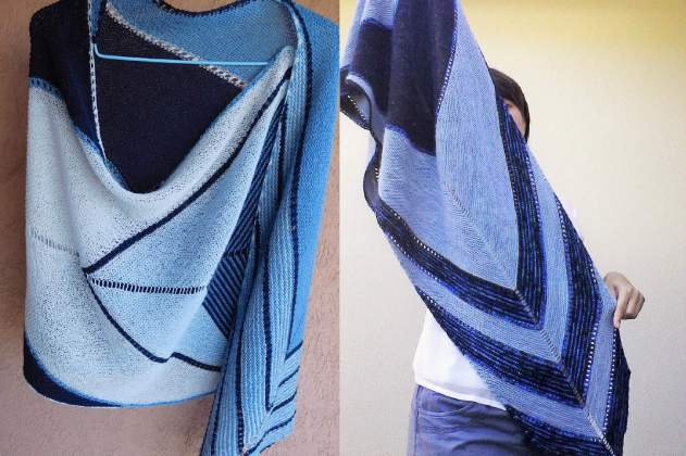
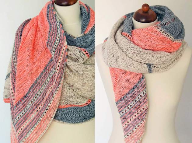
Elisa and Susi went with shades of blue, which is always a safe pick.
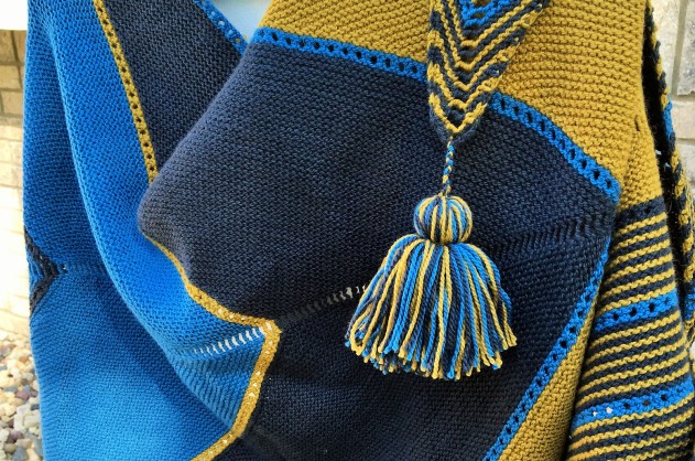
Tracy had the same thought but added in a mustard shade for accent. And look at that tassle, isn´t it fantastic?
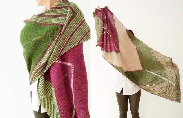
And Tanya combined a moss green with a warm pink-red and a creme shade to great effect.

This shot was clearly photo-bombed. But we don´t get distracted from Ramona´s perfect choice in colours: Mustard, fir green and steel blue are an unexpectedly great match with a back-to-nature feel to it. Maybe that´s because Ramona hand-dyed the colours herself, using plant pigments.
