
How do we see colours? What is interesting about them to us knitters? Those are the things I have been thinking about lately.
Colours don´t stand on their own, they always interact with one another. It doesn´t actually happen in real life that all we see is one colour. And our perception of any particular colour heavily depends on the context we see it in.
For example, the exact same grey can look very different when it is put on a blue versus an orange-brown shade.

Only when you add a grey frame and, from the frame, lines to the two grey squares connecting them with the frame, does it become evident that it is, indeed, the same grey.

And the identical grey looks different if projected on black versus white horizontal stripes, as is illustrated on the left below. The image on the right shows the blocks of grey without overlapping stripes.

The next example illustrates a similar illusion. A solid grey appears to have a gradient if placed on a gradient background. Again, on the right you see the grey block without the gradient background revealing how our eyes have been deceived.

There´s also this mind-boggling effect of the complementary afterglow. Stare at this bright blue for about 60 seconds, and make sure to actually last that long, then on the white image on the right, focusing on the grey squares in the centre each time. You should see an afterglow in the complementary colour, i. e. in yellow. This is something our brain does. Whenever the complementary colour is missing, it is assumed and added by some process in our brain. Researchers are still debating what´s behind this effect. Probably a contributing factor is the fatigue of the colour receptors of the eye. If a receptor for a colour gets tired, the colour it is absorbing, which is always the contrast colour, gets enhanced.

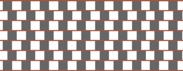
We also tend to subconsciously assume volume in 2-dimensional images. All of the following lines are perfectly parallel. Hard to believe, right?
It´s tempting to use this in a future design, but I kind of get the feeling I might cause some headaches with that. And being a headache sufferer myself, I definitely want to avoid that.

[…] know how our screens can deceive us!). – Read more about the complex interaction of colours in a recent post on the blog. – Also, Rosy regularly presents colour combinations on her Instagram and suggests […]
What iis the name of the theme that you’re using? It
looks good.
First of all I want to say terrific blog! I had a quick question that I’d like to ask if you do
not mind. I was curious to know how you center yourself and clear
your head prior to writing. I’ve had difficulty clearing my mind in getting my ideas
out there. I do enjoy writing however it just seems like the first
10 to 15 minutes are usually wasted simply just trying to figure out how
to begin. Any recommendations or tips? Thank you!